NYC.gov
NYC.gov is the official website for New York City serving an estimated 8 million residents. The website contains information pertaining to important alerts, 311 services, news, programs, events, government employment, the office of the mayor.
The Brief
NYC.gov is the official website for New York City serving an estimated 8 million residents. The site contains useful information for citizens including alerts, 311 services, news, programs, events, government employment, and the office of the mayor.
My solution was to reorganize the navigation and re-index the information for wider breath and less depth of navigation. I felt it was appropriate for a broad audience being that not all NYC residents are computer literate and still deserve access to services. By broadening the breadth and using more familiar terms, NYC.gov becomes more accessible to a wider audience.
The Audience
People in NYC who are interested in their garbage collection schedule.
People who like planning what garbage they will put out on certain days.
People who want to add their pick up dates to their calendar for reminders.
.
The Team: Henry Thomas McNally
My Role: Content Audit, sitemaps, USER FLOWS, User research, CARD-SORTING, Tree-testing,LO-Fidelity Wireframes, Mid- Fidelity WireframES, HEURISTIC ANALYSIS & PrototypING

Information Architecture
I redesigned the navigation and restructured the IA of NYC.gov to help users find their local trash pickup schedule more easily.
Content Audit:
I began the project by first trying to find the Schedule for Garbage and Recycling for my home address in Brooklyn, which took me over 5 minutes to complete. I then went back to perform a Content Audit on the current Information Architecture which would inform my Site Map.

Heuristic Analysis
I conducted a Heuristic Analysis of the existing site using the Abby Method.
Initial Site Map
Creating a site map of the existing navigation and IA of NYC.gov was a real challenge. The number of subcategories and redundant information was extensive, taking the user seven clicks from the home page to get their garbage and recycling pick up schedule.
User Flow
The Initial User Flow is complex, taking seven clicks to complete the task.
Initial Observations
Information was hidden more than 7 layers of navigation
Nomenclature used for Main navigation tabs is misleading
Research
I began by researching the IA and Navigation of competitor websites: Yonkers, Syracuse and Los Angeles. These municipal pages directly assist citizens with locating services and resources. I also chose websites that were similar in scope and market, including NYC Parks Dept. and Boro Wide Waste Management, to compare how they manage their data and navigation.
NYC.gov is the most informationally dense and offered more services online than the comparators, it also had the most confusing navigation of the lot.
User Research
I recruited four tech-savvy NYC residents to participate in completing the task. I observed and timed them, and results were as I suspected:
1 in 4 completed the task in under 5 minutes
1 in 4 completed the task in under 7 minutes
2 in 4 abandoned task in frustration, 1 after 3 minutes and 1 after 6 minutes. Both participants were extremely confused and were lost in the wrong tabs.

Testing
I used the online resources on Optimal Workshop to perform a Tree Test and an Open Card Sort. With those results I redesigned the Navigation to suit my User’s needs
Tree Testing Results:
Open Card Sort Results:
Design
Taking all my research and testing into account for the redesign, I logically restructured the navigation. I consolidated categories, renamed and divided others according to relevant themes. I found the most redundancy between the first two tabs on the site, which were Resources (an index of every other tab) and NYC 311—the city helpline that people can call with complaints and service requests. I renamed this new consolidated tab “Services,” which is more ubiquitous when thinking of garbage removal. The Welcome page had an NYC 311 helpline widget with real-time data of city services displayed and interactive questions; I added this to the main Navigation so any visitor would be able to request assistance at any moment.
Lo-fidelity Wireframes
I drew wireframes to test out some ideas quickly and received excellent feedback. I made a few quick changes before moving into my Mid-Fi Wireframes.


Revised User Flow
Redesigned Site Map
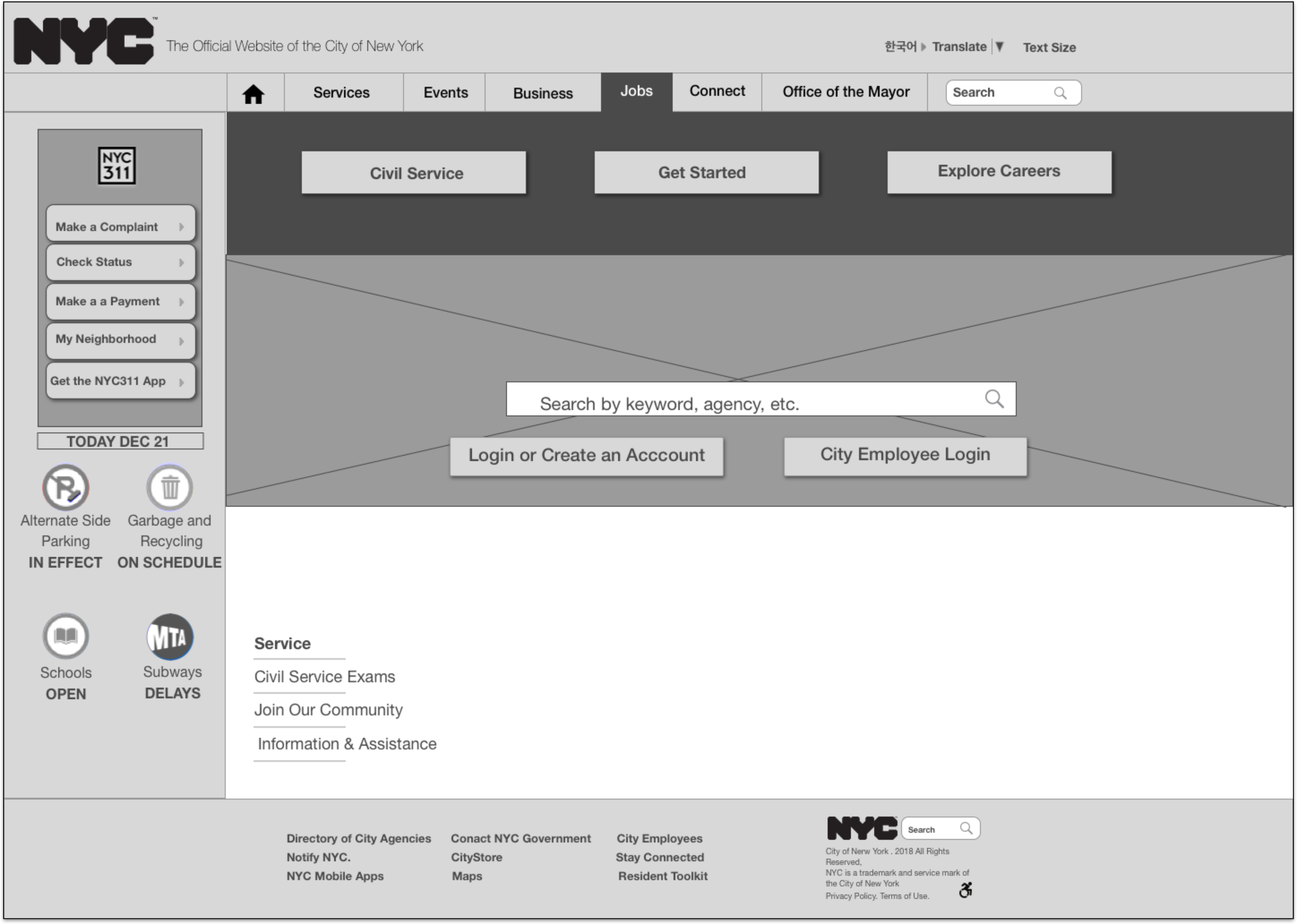
Navigation Study & Annotated Wireframes
Navigation states for each of the tabs, some of the positions have changed during the redesign, the NY311 and Resources Tab has been consolidated into the new services Tab
The NYC 311 widget stays with every navigation state, the icon's are not functional and only used to display information
Footer with SEO links
Mid-Fidelity Wireframes & Prototype