Karmeq
Karmeq is a newcomer to the Fintech realm, their mission is to make gifting shares of stock as ubiquitous as writing a cheque. Whether celebrating a marriage or the birth of a child, users can gift stock that will grow in value. Users can also donate stock or create campaigns to donate to their favourite charities through the platform.
The Brief
We were tasked with creating the UI, design language, branding and main components for Karmeqs MVP. A preliminary research report had been created to guide us, basic market research and prospective user interviews,
The Team: Henry Thomas McNally Meghna Raghunathan
My Role: UI Design, High-Fidelity wireframes, Prototyping.

Web App | UI Design
Sign Up, Onboarding & Settings Screens
Research
In the realm of Fintech we noticed that direct B2C (Business to Customer) Applications were still a nascent direction for the industry. Our designs were informed by this in a myriad of ways, primarily we would need to make the product extremely “New User” friendly. The tone of the product should be lighthearted include photos, be colorful and include metaphorical symbols, but also needed to be clear and concise so users would want to use the product instead of just writing a cheque.
Comapratrive/Competitive Analysis

Design
Through visual exploration and research we found many customer facing financial sites use green and complimentary color schemes as secondary colors. Most of these sites use their brand name as the primary focus of their logo.

Sign up Screen & Onboarding 01.
The first screens we targeted were the sign up screen and the Onboarding. Looking back to our research we observed that inviting illustrations were being used, We decided on a split screen format to display the hero image and the sign-up prompt. Assuming that the user had not used the platform before, we made the sign-up the main CTA.
The purpose of our inital onboarding was to collect the most basic information for the user. We researched similar websites to see what the minimal amount of necessary information we needed to include to make this experience as streamline as possible for the end user.


Onboarding 02.
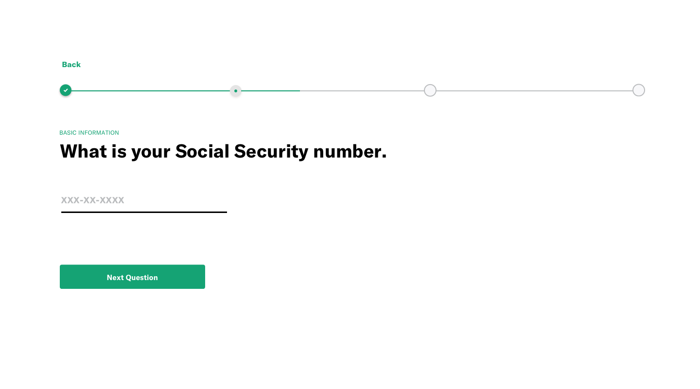
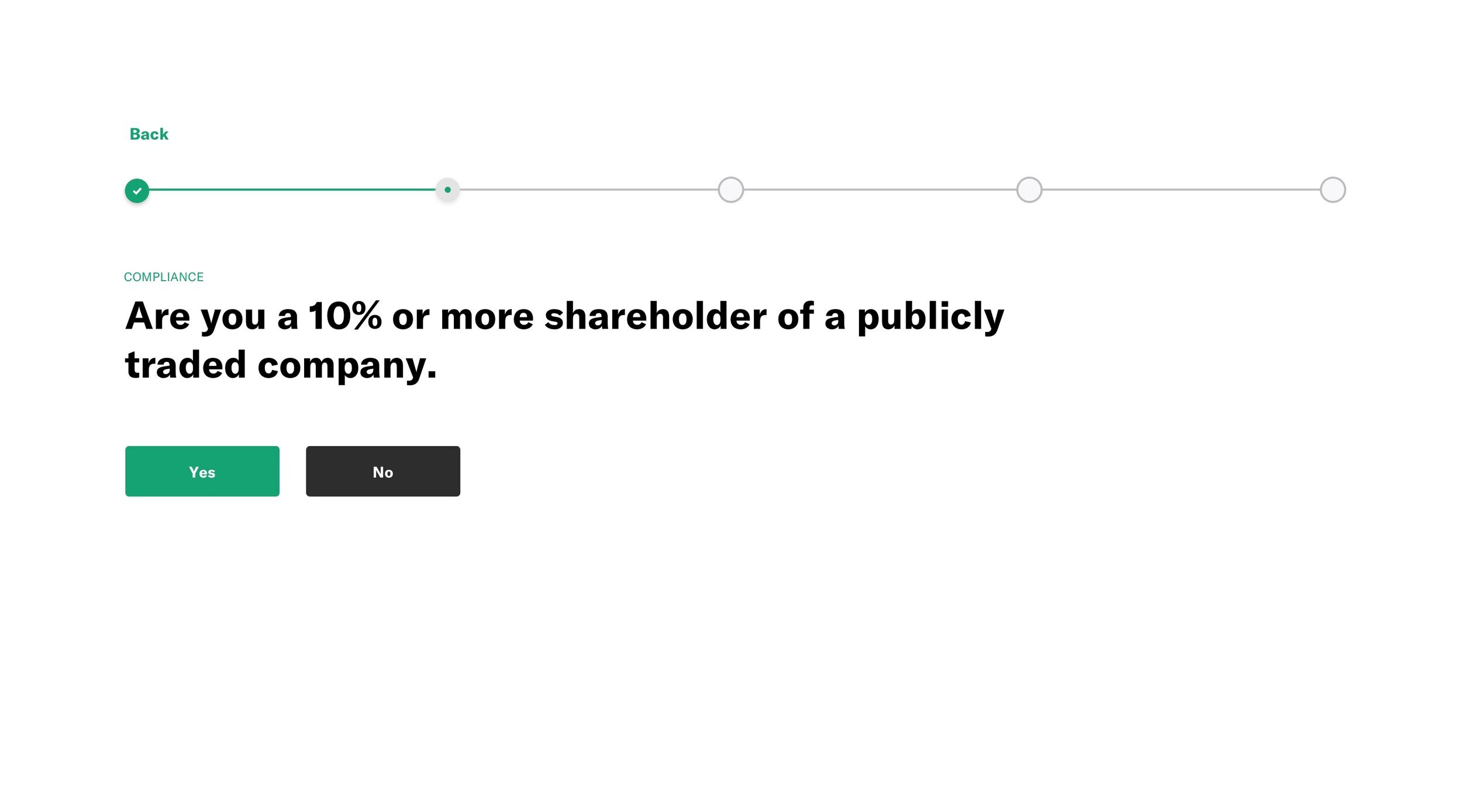
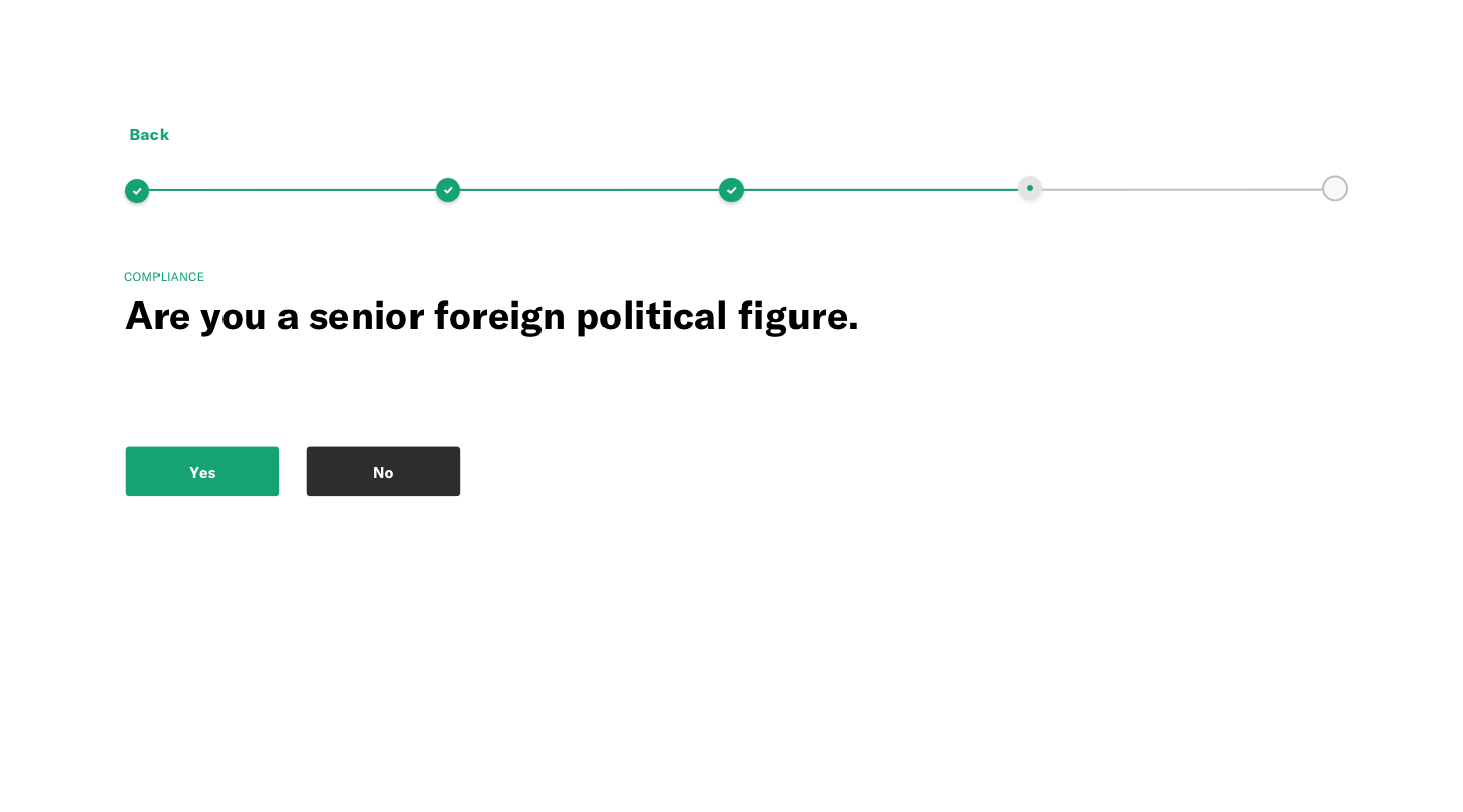
This product being a stock registry meant that we had certain legal formalities to oblige to. We needed to make sure that we included all the legal questions to get a user set-up to buy, sell, and trade stock; yet present It in a way that showed progression and kept the experience short and to the point.
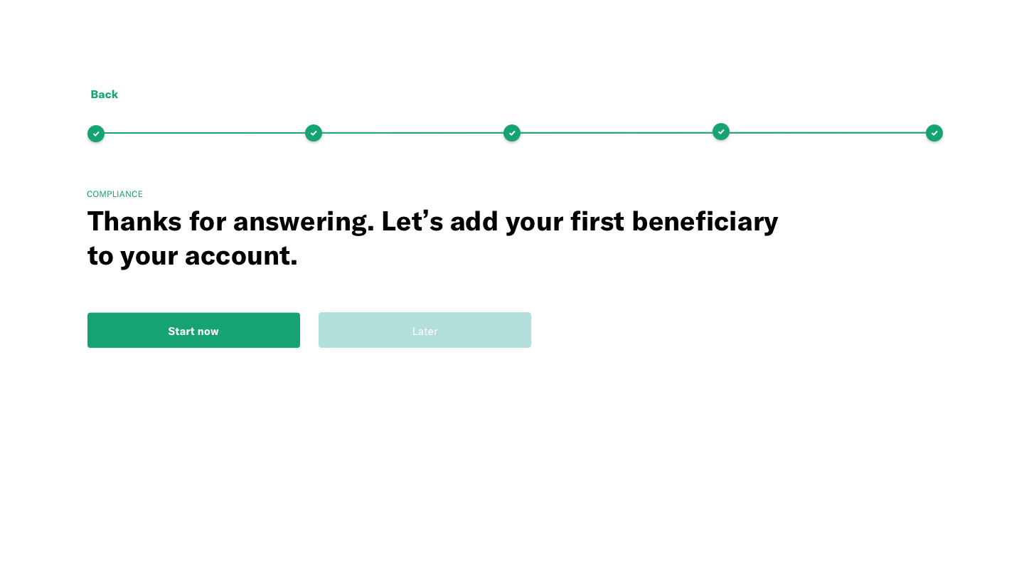
Adding a Beneficiary
Upon completion of this set of questions, the user is prompted with the final question of whether or not they would like to add a beneficiary to their account.


Onboarding 03.
One of the main goals of this stock registry is to allow for an adult to create a custodial account for their child. The vision is to be able to gift a child stock that will grow with them through the years, and use as they would a college fund or savings account. This third set of screens shows the basic info. required for that account to be created.


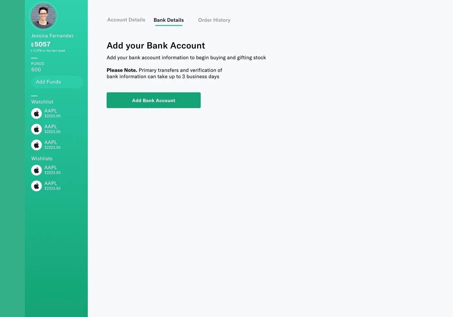
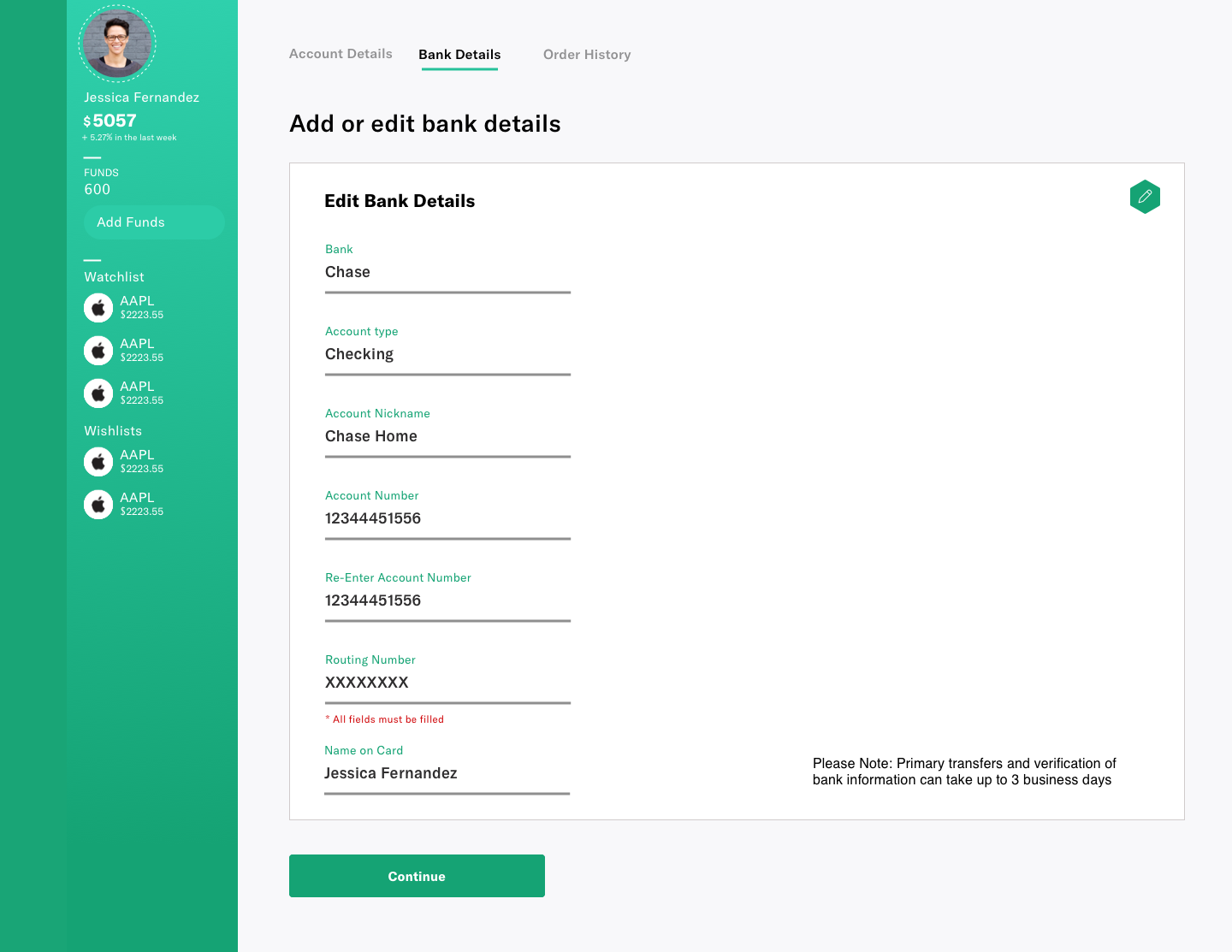
Profile Nav. & Account Settings
Our next focal point was to build up the side navigation for the account view: User profile photo, funds available for use, the option to add money to their account. This is also the area in which the user could view what stocks have been added to their “Watch & Wishlists”. We sketched out several designs for this and decided on the left side navigation being the best in terms of visual hierarchy and on trend. Again, we researched existing sites to see what information was absolutely needed when adding bank details.