


CentSai
CentSai Is a financial literacy website that helps its users mainly Millennials and Generation X navigate the myriad financial decisions they’ll need to make in life. From buying their first home, to determine what type of insurance they need, to negotiate a better salary, CentSai brings direct, actionable, and relatable advice via first-hand accounts.
The Brief
This project focuses on developing a creative, compelling, ‘gamified’ UI/UX for traditional financial calculators. Based on user research, we hoped to transform their use into enjoyable experiences that will encourage consumers who aren’t comfortable with personal finance to ‘jump into the pool’ by using the spirit of the quizzes, games, videos and creative content found in CentSai’s library.
Our goal was to engage users and invite them to use our calculator by reducing financial jargon while still arriving at the same destination as the traditional model.
We wanted to provide a functionally pragmatic and relatively easy-to-use prototype that developers can then use to build a production-ready version.
The Team: Henry Thomas McNally JayShin Mike Shin
My Role: User Interviews,User Flows, Usability Testing, High-Fidelity wireframes, Prototype & presentation design

Product Design
We created an easy to use and enjoyable Personal Savings Calculator based on boardgames to engage and entertain while educating the user
Hypothesis
People find financial planning to be confusing, daunting, intimidating, boring, overly complex. How might we make it quick & easy to learn, fun, illuminating, shareable and meet their goals?
User Research
We created two screeners to find participants for our interviews: one for existing users of Centsai and one for prospective users. We interviewed twenty-six participants, ensuring a 50–50 gender split among interviewees. We considered this important given that 50% of CentSai Users are women.
Our interview questions were extremely broad: we asked about financial literacy, genres of entertainment individuals learning styles and feelings on financial planning.
I also conducted market research of companies within the personal finance sector, such as the Clarity and Albert apps, which help users save for large purchases and/or events such as weddings or vacations. I looked at two major banking institutions, USAA and Chase, which also include personal savings calculators on their websites. Using this information I created two competitive/comparative analysis charts: one based on competing and comparative firms and the other for the most popular personal finance calculators available on the internet.


Synthesis
Through our research we found the common goals, pain-points and opportunities people experienced in saving for large purchases, vacations and/or events.
WE USED AN AFFINITY MAP TO SYNTHESIZE THESE INSIGHTS AND DEVELOP OUR PRODUCT ACCORDING TO CENTSAI USERS’ NEEDS


Insights:
People consider financial literacy & planning important but not easily entered into.
The jargon associated with financial calculators creates a barrier of entry to their use.
People want to be entertained while they learn.
Quotes:
“Personal Finance is essential for people to understand.”
“Finance can become too complex with the terms and conditions I don’t fully understand.”
“I have had 2 advisors in the past and both have been helpful and led me in the right direction leading me to better decisions than what I would have done alone.”
Persona & User Journey
We created our persona, Sam, using the insights we garnered from an affinity mapping session. I decided Sam would be focused on saving for vacation because that was a common goal for nearly all the interviewees


A major painpoint for our user is the inaccessibility of financial terms and jargon.
Exploring The Problem Space
With the information from our Persona, User Journey and secondary research taken into account, I refined our hypothesis and developed a problem statement.
Problem Statement:
People find financial planning to be confusing and difficult. This leads people to avoid financial matters or to seek-out professional assistance. How might we give people more control and understanding of their finances with a fun and easy-to-use financial calculator?
Design
Our Design Studio focused on narrowing down the narrative for the calculator, the type of content we would include, and then designing our wireframes from that. We want to create an engaging, fun atmosphere while also being educational. We wanted to improve the user experience of using a financial calculator while also keeping with the CentSai spirit of teaching through storytelling and desire to empower people to build financial security through knowledge.
We defined our success metrics using a HEART Matrix

The Solution
WE TOOK THE THE INSIGHTS GAINED TO DEVELOP AN ENGAGING, FUN USER EXPERIENCE FOR THE CENTSAI PERSONAL SAVINGS CALCULATOR.
Users had a game piece which would follow them along the journey through the game depending on which calculator they chose
The calculator is set up in a series of pods that the user uses to input different financial information with a dotted line leading the way along a well defined path.
There would be a status bar to show the user which step they were on during their journey through the calculator.
The Goal and results for each calculation would be displayed every step of the way to delight and encourage the user along the way
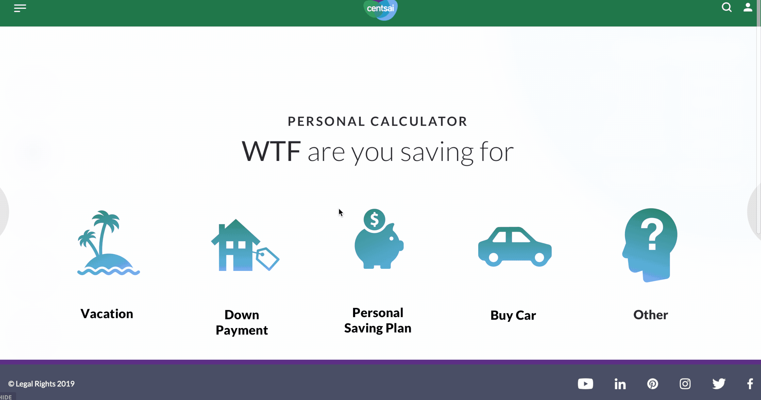
We integrated our calculator into CentSai’s popular “WTF is...?!” series of articles which explained Financial terms in layman’s terms.
Information Architecture & User Flow
We added our Calculator to CentSai’s main navigation menu. The User Flow is very straightforward:

Mid-fi Wireframes & Usability Testing
With the lo-fi wireframes sketched, we developed two versions of mid-fi wireframes, both in keeping with the board game theme we had decided upon in our Design Studio sessions. We chose to move forward with the circular “pod” idea for the user input fields as opposed to the rectangular version because it felt more like a board game and less like the calculators I came across in my research.
Two rounds of testing with five participants for each round
Testers consisted primarily of Gen X-ers and Millennials.
Testers were evenly divided between men and women.
Testers had diverse levels of financial literacy.

1st iteration of calculator concept wireframes

2nd iteration of calculator concept wireframes
Usability Findings:
8/10 Found the calculator easy to use
7/10 Appreciated explanations of financial terms
10/10 Enjoyed using the calculator
Quotes:
“Very Intuitive and easy to use…”
“The ‘WTF’ theme made it fun!”
“Love that it didn’t feel like a calculator.”
“I would like to save my info. For reference.”
High Fidelity Wireframes
After two rounds of usability testing with 10 participants in total, we designed the high-definition prototype keeping on brand with CentSai using complimentary colors from their logo and the established branding to integrate it seamlessly with their existing site.
One change from the mid-fi to the hi-fi wireframes was a change to the expenses ‘input Pod.’ Many users wanted to list their expenses separately and then have them summarized by our calculator as opposed to adding them up on their own.


Next Steps:
Enhance the interactivity by increasing ways to calculate for goals.
Add a collaborative feature to share your savings goals with friends.
Create a standalone application with the ability to save the information and results and use offline.